Dots, Pixels, and Pigments: Georges Seurat's Scientific Color Theory
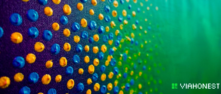
A point of blue beside a point of yellow can produce an optical impression of green without the two pigments ever touching. Move closer and the green separates into distinct marks. Step back and the eye reconstructs a unified field of color. This controlled relationship between pigment, light, placement, and viewing distance is central to Georges Seurat color theory and to the method now commonly known as pointillism.
Seurat did not simply replace brushstrokes with dots. He sought to transform painting from an intuitive practice into a systematic study of perception. Drawing on nineteenth-century research into simultaneous contrast, complementary colors, and optical mixture, he organized small units of pigment so that their interactions would occur partly on the canvas and partly in the viewer's visual system. The resulting surfaces appear stable from one position and vibrantly active from another.
Understanding this method requires a clear distinction between physical pigment mixing and optical color mixing. It also requires an understanding of value, chroma, complementary contrast, dot placement, and scale. These principles remain useful far beyond neo impressionism art. They can inform illustration, printmaking, concept painting, raster graphics, dithering, and contemporary pixel art.
For artists who work with repeatable systems and carefully controlled marks, the same precision can also support collectible editions. A technically accomplished image can move from an original study to a documented series of limited edition prints, allowing the artist to reach international collectors without sacrificing the scarcity or identity of the work.
The Transition from Intuitive to Scientific Painting
By the late nineteenth century, Impressionist painters had already challenged academic conventions through direct observation, broken brushwork, and heightened attention to changing light. Their color was often immediate and responsive. Seurat accepted many of these discoveries but wanted a more deliberate structure. Rather than relying primarily on instinct, he investigated how visual effects could be planned.
His approach was influenced by scientific and aesthetic theories circulating in France at the time. Michel Eugène Chevreul's research on simultaneous color contrast explained how one hue changes in appearance when placed beside another. Ogden Rood discussed the difference between colors mixed as light and colors mixed as physical materials. Charles Henry attempted to connect lines, directions, and colors with emotional response. Seurat absorbed these ideas selectively and turned them into a disciplined studio method.
This transition did not eliminate artistic judgment. Scientific principles supplied a framework, not an automatic formula. Seurat still had to decide which relationships served a composition, how large each mark should be, and where a passage needed stronger contrast. His achievement was to connect those aesthetic decisions to observable behavior in human vision.
The monumental painting "A Sunday Afternoon on the Island of La Grande Jatte" demonstrates the result. From a normal viewing distance, figures, trees, water, clothing, and shadows appear organized into broad color zones. At close range, those zones dissolve into countless separate strokes and dots. Warm notes activate cool shadows. Orange accents intensify nearby blues. Light areas contain more chromatic variation than their apparent simplicity suggests.
A macro photograph of the painting reveals that Seurat's surface is not a mechanical screen of identical circles. The marks vary in direction, shape, density, and color. This variation is important. Pointillism becomes visually effective not through repetition alone, but through controlled differences between neighboring units.
Divisionism vs. Pointillism
Divisionism and pointillism are related terms, but they do not describe exactly the same thing. Divisionism is the broader color theory. It refers to separating hues into distinct touches so that pigments retain more of their individual intensity and combine optically at a distance. Pointillism is a specific application technique in which those touches are reduced to dots or compact marks.
An artist can therefore use divisionism without making every mark circular. Short strokes, tiles, dashes, and pixel-like units can all divide color. Likewise, a painting covered in dots is not automatically divisionist. If the dots are randomly chosen or physically blended into uniform mixtures, the work may imitate the appearance of pointillism without applying its chromatic logic.
The distinction matters because the pointillism technique is not merely decorative. Its purpose is to control how adjacent colors interact. Dot placement determines whether a passage blends, flickers, recedes, advances, or breaks into visible pattern. A cool field punctuated with small warm units may feel luminous. Equal quantities of two strong complements may create visual vibration. Closely related hues can produce a quieter and more continuous transition.
In practical terms, divisionism asks which colors should remain separate. Pointillism asks how those separated colors should be applied. The first is a perceptual strategy. The second is one possible mark-making system.
This distinction also clarifies the role of neo impressionism art. Neo-Impressionists did not simply imitate Seurat's dots. Artists such as Paul Signac developed individual forms of divided color, often using larger and more directional marks. The shared principle was a structured separation of color intended to preserve luminosity and organize contrast.
The Subtractive Color Spectrum in Pigments
Subtractive color theory art begins with the physical behavior of pigments. A painted surface is visible because light strikes it and selected wavelengths are reflected toward the eye. Pigments absorb, or subtract, part of the incoming spectrum. The wavelengths that remain determine the perceived color.
A yellow pigment reflects much of the yellow, orange, and green region while absorbing substantial portions of blue and violet light. A blue pigment reflects more of the blue region while absorbing many warmer wavelengths. When yellow and blue pigments are physically mixed, their absorption properties overlap. The mixture reflects a narrower range, often perceived as green, but it generally reflects less total light than either component. The result is usually darker and less chromatically intense.
This is why mixing several pigments together can produce brown, gray, or near-black. Each added pigment subtracts additional wavelengths. Physical mixing does not accumulate light. It filters it.
The traditional painter's model identifies red, yellow, and blue as primary pigments. Modern printing and color science more accurately use cyan, magenta, and yellow because these colors provide a wider subtractive mixing range. Actual artist pigments, however, are never mathematically pure. Every tube has a spectral bias, opacity level, tinting strength, and material character. A warm blue mixed with a warm red behaves differently from a green-biased blue mixed with a cool magenta.
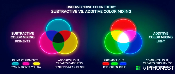
Additive color works in the opposite direction. Screens and projected light begin with darkness and add red, green, and blue light. Combining all three at sufficient intensity approaches white. Pigment systems begin with a light-reflecting surface and subtract wavelengths from the illumination. Combining pigments generally moves toward darkness.
Optical color mixing occupies a more complex position. Separate pigments remain subtractive materials on the canvas, but the viewer perceives their reflected light together. Blue and yellow dots may suggest green from a distance, yet the effect is not identical to a smooth green pigment mixture. The original components remain partially visible, preserving local variation and often producing greater liveliness.
The Munsell color system offers contemporary artists a useful way to plan these relationships. It separates color into hue, value, and chroma. Seurat did not base his historical practice on Munsell's later system, but modern artists can use it to analyze divisionist passages with greater precision. Hue identifies the color family, value measures lightness, and chroma describes intensity. Optical mixture works best when all three dimensions are considered rather than hue alone.
A subtractive color mixing infographic can make this distinction clear. Overlapping cyan, magenta, and yellow pigment zones demonstrate increasing absorption, while adjacent unmixed dots show how optical synthesis can suggest a new color without creating the same physical mixture.
Methodological Execution of Optical Color Mixing
A successful divisionist image cannot be built by scattering bright dots over an unresolved drawing. The method depends on an underlying hierarchy of value, shape, edge, and color. Each mark must contribute to a larger visual structure.
Before beginning, determine the final display size and expected viewing distance. A dot that blends effectively in a small illustration may remain conspicuous in a large print. Conversely, marks designed for a mural may disappear when the work is reduced. Optical color mixing is therefore both a chromatic and spatial calculation.
The artist should also establish a limited pigment strategy. Select colors according to their temperature, transparency, lightfastness, and mixing behavior. A palette of controlled primary pigments, complements, and neutrals is usually more predictable than a large set of unrelated colors.
Step 1: Monochrome Value Underpainting
Begin with a monochrome value study. Reduce the composition to major light, middle, and dark zones before introducing complex color relationships. This stage ensures that the image remains readable even when later chromatic activity becomes intense.
The underpainting can be executed with a neutral pigment or a restrained complementary tone. Its purpose is not to finish every detail. It establishes proportions, silhouettes, focal emphasis, and the distribution of visual weight. Thin application is preferable because heavy opaque layers may interfere with the clarity of later marks.
A grayscale reference is useful for testing the value structure. If the composition collapses when viewed without hue, more dots will not repair it. Pointillist color may enrich value boundaries, but it cannot replace them.
The underpainting also controls luminosity. Areas intended to glow should retain a lighter foundation. Dark passages can receive a deeper base, but excessive black may deaden subsequent color. Chromatic darks built from deep blue, red, violet, and green often remain more active than flat black.
Seurat's preparatory practice included numerous drawings and painted studies. This disciplined planning allowed the final surface to carry complex color without losing compositional order. Contemporary illustrators and concept artists can apply the same sequence by separating value design from chromatic execution.
Step 2: Dot Density and Chromatic Vibration
After the value structure is stable, introduce divided color according to density, size, and interval. These variables determine how strongly the marks blend at a distance.
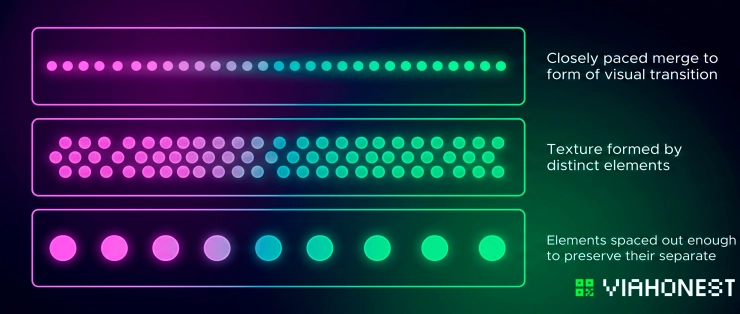
Small, closely spaced dots tend to merge more readily. Larger dots and wider intervals preserve visible texture. Uniform marks can produce a calm, screen-like field, while controlled variation creates movement. The correct choice depends on the dimensions of the work and the intended viewing conditions.
A useful test is to inspect the image from at least three distances. At close range, individual pigments should remain identifiable. At the intended viewing distance, the marks should organize into coherent color fields. From farther away, the value structure and principal shapes should remain clear.
Chromatic vibration occurs when adjacent hues compete rather than fully merge. Complementary pairs such as blue and orange, red and green, or yellow and violet can intensify one another through simultaneous contrast. The effect becomes strongest when both colors possess comparable value and high chroma. If one is much darker, the relationship reads more as value contrast than pure color vibration.
Visual vibration must be controlled. Strong complementary contrast across the entire image can create fatigue and weaken the focal point. Reserve the most active relationships for important edges, illuminated passages, or areas intended to advance. Use analogous hues and reduced chroma where the composition needs rest.
Dot placement can also model form. Increase warm notes on planes turning toward warm light, and introduce cooler marks into receding planes or reflected shadow. Avoid treating each object as a single local color. A green tree may contain yellow, blue, violet, orange, and neutral units while still reading as green at the correct distance.
An optical synthesis diagram can demonstrate this process by comparing equal blue and yellow dots, a yellow-dominant ratio, and a blue-dominant ratio. The perceived result changes not only with pigment selection but also with proportional coverage.
Step 3: Complementary Frame Enclosures
Seurat extended color division beyond the central image by using painted borders and complementary frame relationships. These enclosures were not neutral decoration. They functioned as active chromatic controls.
A surrounding band can alter the perceived intensity of the colors inside it. A cool enclosure may make a predominantly warm scene appear warmer. A dark dotted border can increase the apparent brightness of adjacent light passages. Alternating complementary notes can create a transition between the painting and its physical frame.
To apply this method, identify the dominant temperature near each edge of the composition. Construct a border that responds to those edge colors rather than repeating them mechanically. The border may introduce complements, darker variants, or rhythmic transitions that prevent the image from feeling abruptly cut off.
The scale of the border marks should relate to the internal pointillism technique. If they are too large, the frame dominates. If they are too fine, the enclosure loses its visual function. The best solution reinforces the center while remaining clearly subordinate to it.
Digital artists can reproduce the same principle with a controlled perimeter palette. Instead of adding a generic outline, build edge pixels that complement the dominant interior colors. This creates separation from the surrounding interface or page while preserving chromatic continuity.
Pointillism in Digital Art, Dithering, and Pixel Aesthetics
The logic of divisionism anticipated many problems later addressed by raster graphics. A digital image is constructed from discrete units. Each pixel has a defined color, yet groups of pixels can create gradients, textures, and intermediate tones that are not physically present as individual units.
Dithering is one of the clearest parallels. When a system has a limited palette, it arranges available colors into patterns that simulate additional shades. Alternating black and white pixels can suggest gray. Blue and red pixels can imply violet. The perceived result depends on resolution, pattern frequency, display scale, and viewing distance, just as a pointillist passage depends on dot density and placement.
The comparison should not be taken as direct technological ancestry. Seurat did not invent raster graphics or modern dithering algorithms. However, both systems address a related perceptual question: how can a limited set of discrete color units produce the impression of a broader continuous range?
Pixel artists can apply Georges Seurat color theory by designing clusters rather than isolated pixels. A cluster should describe form, value, and material while contributing to the overall palette. Random noise rarely produces convincing optical mixture. Structured patterns create more stable transitions and more intentional visual vibration.
Ordered dithering uses repeatable matrices, while error-diffusion methods distribute quantization differences across neighboring pixels. An artist working manually can combine these ideas with selective irregularity. Regular patterns are effective for flat gradients and atmospheric zones. Broken patterns are useful around focal details, textured surfaces, or organic edges.
Subtractive color theory art also remains relevant when digital work is prepared for physical printing. A luminous RGB image may shift when translated into CMYK inks because the output returns to a subtractive process. Highly saturated screen colors can fall outside the printable gamut. Artists should evaluate proofs, adjust dark mixtures, and confirm that small dots remain distinct at the chosen print resolution.
The Munsell color system can help organize digital palettes by separating value and chroma decisions from hue selection. This is especially useful for limited-palette illustration. Two colors that seem dramatically different on screen may share nearly identical value and become difficult to distinguish when printed. A value check reveals the problem before production.
For contemporary pixel artists, pointillism offers more than a historical visual style. It provides a method for deciding how local units cooperate across an image. The pixel is not only a square mark. It is a measurable color event whose effect changes according to every neighboring event.
Sell Your Technical Masterpieces Globally
Works built through divisionism, dithering, precise pigment application, or pixel-level construction reward close inspection. That makes them especially suitable for high-quality limited edition prints. Collectors can experience both the unified composition from a distance and the technical surface at close range.
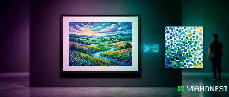
A limited edition should preserve the qualities that make the original compelling. Resolution must be sufficient to reproduce individual dots and edge relationships. Color management should protect subtle complementary contrast. The chosen paper or print surface should support the intended balance between saturation, detail, and archival stability.
Edition size also matters. A clearly defined run gives collectors verifiable scarcity while allowing the artist to sell the same composition more than once. Each print should be associated with consistent information, including title, dimensions, medium, edition number, production method, and artist attribution.
ViaHonest gives independent artists a marketplace for presenting original work and limited edition prints to collectors beyond a local audience. A professional listing can explain the technique, document the edition, and show detailed images of dot placement, pigment texture, or pixel construction. This context helps buyers understand why a technically rigorous print differs from a mass-produced decorative reproduction.
For illustrators, graphic artists, concept painters, and pixel artists, the opportunity is not limited to selling an image. It is an opportunity to present a complete artistic method. Process details, close-up views, and information about palette construction can strengthen the perceived value of the edition and give collectors a deeper connection to the work.
Launch your limited edition prints on the ViaHonest art marketplace with accurate specifications, strong detail images, and a clear account of your technique. Turn scientific color research into a collectible body of work that can be discovered by art buyers around the world.
Conclusion
Georges Seurat's importance lies not in the invention of the dot as a decorative mark, but in his systematic coordination of color, perception, and structure. Divisionism separates pigments to preserve chromatic activity. Pointillism supplies a precise method of application. Subtractive color theory explains what happens when pigments physically absorb and reflect wavelengths, while optical color mixing explains how separate marks can produce a combined perceptual effect.
The method begins with value, develops through controlled dot density, and gains intensity through complementary contrast. Its principles extend naturally into dithering, raster illustration, and pixel art, where discrete units must create coherent color fields under technical limitations.
Artists who master these relationships produce work that is both visually immediate and intellectually structured. By translating that precision into documented limited edition prints and presenting them through ViaHonest, they can preserve the integrity of their technique while reaching collectors globally. Every dot, pixel, and pigment becomes part of a reproducible system, but the artist's decisions remain unmistakably original.