Deconstructing Van Gogh’s Impasto: Directional Strokes and Line Dynamics
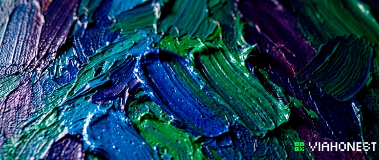
Learning how to paint like Van Gogh does not mean copying sunflowers, cypress trees, or star-filled skies. The deeper lesson lies in understanding how Vincent van Gogh converted observation into physical movement. His paintings do not merely describe objects. They organize color, line, and texture into visible currents that guide the eye across the surface.
The familiar Van Gogh painting style emerged from deliberate technical choices. Thick oil paint created tangible relief. Directional brushwork established movement and spatial pressure. Dark outlining separated forms, while adjacent strokes of relatively pure color preserved chromatic intensity. Together, these methods transformed ordinary landscapes, portraits, and interiors into emotionally charged structures.
Modern artists can study these post impressionism techniques without turning their work into imitation. The goal is to understand the system beneath the image, then adapt that system to an individual subject, palette, and visual language. Whether you paint with oils, acrylics, or a digital workflow in Spaces, Van Gogh's approach offers a practical model for building expressive surfaces that feel both spontaneous and controlled.
The Physical Mechanics of Van Gogh's Expressive Style
Van Gogh's technique is often described as impulsive, but close observation reveals careful organization. His marks follow the structure of forms, distinguish spatial zones, and create visual rhythm. The intensity of the finished painting comes from coordination rather than uncontrolled gesture.
Paint itself becomes part of the subject. A field is not represented only by yellow pigment. It is constructed through repeated strokes that suggest heat, wind, growth, and resistance. A face is not simply modeled with smooth transitions. It is mapped through directional marks that reveal bone structure, tension, and emotional presence.
This relationship between material and perception is central to understanding how to paint like Van Gogh. Brushwork must do more than fill an outlined shape. Each mark should contribute information about volume, movement, light, or atmosphere.
Directional Brushwork as Spatial Vector
In conventional academic painting, brushstrokes are often blended until they become visually unobtrusive. Van Gogh frequently did the opposite. He allowed individual marks to remain visible, turning each stroke into a spatial vector with a clear direction and energy.
Consider how different directions affect perception. Horizontal strokes can stabilize distant land or establish a calm horizon. Vertical marks can make trees, figures, and architecture feel upright and forceful. Diagonal strokes introduce instability, speed, or recession. Curved and spiraling marks imply turbulence, circulation, and continuous motion.
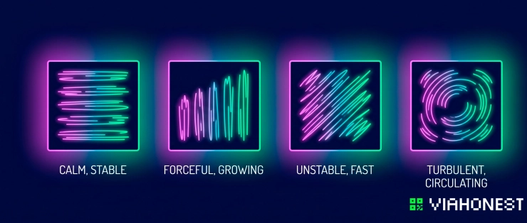
This is the foundation of the Van Gogh brush stroke technique. Before placing a stroke, determine what it should communicate. A mark following the contour of a cheek reinforces volume. A series of rising strokes in a cypress tree emphasizes growth. Short, broken marks across a road can establish perspective while creating a rough, vibrating surface.
Directional brushwork also separates spatial zones without requiring realistic detail. The sky may move in broad curves while the ground is built from compressed diagonals. Buildings can be defined through firmer vertical and horizontal strokes. The viewer reads these changes as differences in material, distance, and atmosphere.
To apply this principle, divide the composition into directional fields. Assign each field a dominant movement based on its physical character and emotional role. Avoid using the same stroke everywhere. Uniform marks flatten the image, while controlled variation creates dynamic space.
Visual rhythm emerges when strokes repeat with subtle changes in length, pressure, angle, and interval. Think like a composer rather than a decorator. Repetition establishes a beat, while variation prevents mechanical regularity. The result should feel coherent without becoming predictable.
The Sculptural Reality of Impasto
Impasto is not simply thick paint. It is paint used as physical structure. Raised ridges catch light, cast tiny shadows, and make the image change as the viewer moves. Oil paint texture therefore contributes to both the depicted light and the real light surrounding the artwork.
Traditional impasto techniques often involve loading a stiff bristle brush with dense pigment and applying it with minimal dilution. A palette knife can create broader planes, sharp edges, scraped passages, and compressed peaks. Paint may be dragged across the surface, pressed into previous layers, or deposited as a distinct raised mark.
The amount of pressure matters. Heavy pressure spreads paint and exposes the texture beneath it. Light pressure leaves a fuller ridge with a clear beginning and end. Turning the brush during a stroke can produce a twisting form, while lifting it abruptly creates a sharp accent.
Van Gogh's surfaces demonstrate that thick paint should not be equally distributed. If every passage has the same relief, texture loses hierarchy. Reserve the strongest impasto for focal areas, bright accents, and forms requiring physical emphasis. Quieter zones can remain thinner, allowing the raised passages to carry greater visual authority.
A durable support is essential. Thick applications place additional weight and tension on the surface, so a properly prepared rigid panel or well-stretched canvas is preferable. Large accumulations should be built with suitable paint or medium rather than unstable mixtures. The objective is expressive relief that remains structurally sound.
Step-by-Step Technical Guide: Applying the Post-Impressionist Workflow
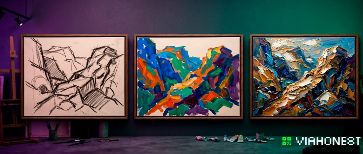
A convincing post-impressionist workflow begins with organization. Expressive painting is not the absence of planning. It is the compression of planning into decisive marks. Establish the composition, control the palette, and determine directional movement before adding the heaviest texture.
Step 1: Structural Charcoal Sketching and Bold Outlining
Begin with a simplified structural drawing. Use charcoal or a diluted dark earth color to locate the largest masses, dominant angles, horizon, and focal point. Avoid small descriptive details. At this stage, the purpose of drawing is to create a framework strong enough to support active color and texture.
Reduce the subject to interlocking shapes. A tree can become a vertical flame-like mass. A face can be organized through the oval of the skull, the angle of the jaw, and the placement of the major features. A landscape can be separated into sky, distant land, architecture, vegetation, and foreground movement.
Once the structure is stable, reinforce selected boundaries with dark outlining. Van Gogh's use of contour was influenced in part by Japanese ukiyo-e prints, where flattened color areas are often contained by decisive lines. In painting, these boundaries can separate similar values, strengthen silhouettes, and prevent energetic strokes from dissolving the composition.
Dark outlining should not surround every object with the same thickness. Vary the contour according to light, depth, and emphasis. A stronger line can bring a form forward, while a broken or lighter edge allows it to merge with the atmosphere. Deep blue, violet, green, and burnt umber mixtures are often more chromatically active than plain black.
The line should participate in the image rather than sit on top of it. Allow contours to thicken at structural turns, disappear in illuminated areas, and reappear where contrast is needed. This creates line dynamics and prevents the outlined forms from looking flat or cartoon-like.
Step 2: Pure Color Placement Without Muddy Blending
Color becomes dull when too many pigments are repeatedly mixed on the palette or scrubbed together on the surface. Van Gogh often preserved intensity by placing distinct colors next to one another. The eye combines them at a distance, but the individual strokes remain active at close range.
Start with a limited palette built around a dominant temperature and one or two complementary relationships. Blue against orange, yellow against violet, and red against green can generate strong vibration. These pairs do not need to appear at equal intensity. One color may dominate while its complement functions as an accent or shadow note.
Mix only enough to establish the necessary families of light, middle tone, and shadow. Place them with confidence, using the direction of each stroke to reinforce the form. If a passage needs adjustment, add a new color note rather than repeatedly brushing the existing layers together.
This principle does not forbid blending. It makes blending selective. Soft transitions can appear in quiet areas, but important passages should retain distinct chromatic units. A yellow field may contain ochre, lemon, orange, and green strokes without becoming a uniform brown. A blue sky can incorporate turquoise, cobalt, violet, and pale neutral marks while remaining visually unified.
Clean tools between major color changes. A brush carrying residue from several complementary mixtures can contaminate every subsequent stroke. Prepare multiple brushes when possible, assigning them to light colors, cool colors, warm colors, and dark accents.
Pure color placement is particularly important when working wet-on-wet. Fresh layers remain vulnerable to physical mixing. Load the brush generously, place the stroke once, and lift it cleanly. Repeated correction weakens both the color and the shape of the mark.
Step 3: Tactile Rhythm and Dynamic Accents
After the major color masses are established, evaluate the painting from a distance. Identify areas where movement stops, forms lose clarity, or the focal point lacks emphasis. The final stage is not about adding detail everywhere. It is about controlling rhythm through carefully placed accents.
Apply fresh paint over the still-responsive surface using short, directional marks. These strokes may follow the existing movement or interrupt it. A sequence of curved marks can strengthen atmospheric circulation. A few sharp diagonals can break a static area. Thick highlights can define petals, stars, facial planes, or reflections without extensive modeling.
Wet-on-wet application produces valuable edge variation. A lightly placed stroke remains distinct, while greater pressure partially mixes it with the layer below. Use this difference intentionally. Clean, raised accents attract attention. Softer, merged marks support transitions.
Change the scale of the brushwork across the composition. Broader strokes establish large movement, medium strokes articulate forms, and small marks provide emphasis. If all strokes are equally small, the painting may become nervous and fragmented. If all are broad, it may lack articulation.
Stop before every area is resolved to the same degree. Van Gogh's visual rhythm depends on contrast between dense and open passages, thick and thin paint, curved and angular movement, and saturated and muted color. The eye needs both stimulation and rest.
Translating Physical Impasto into Digital Art Engines
Digital artists cannot rely on real paint casting physical shadows, but they can reconstruct the perceptual logic of impasto. The essential task is to separate color, directional mark-making, relief, and lighting into controllable layers.
In a Spaces workflow, begin with a color layer that contains visible directional brushwork. Build a grayscale texture input in which lighter values represent raised paint and darker values represent recessed areas. Feed this information into height or displacement nodes to generate an impasto depth map. The relief should follow the direction of the painted marks rather than applying random texture across the entire image.
Use masks to vary depth by compositional importance. Focal highlights can receive stronger elevation, while background passages remain comparatively shallow. A uniform depth setting creates a synthetic embossed effect that does not resemble intentional oil paint texture.
Connect the relief information to lighting and shadow nodes so raised marks respond consistently to a chosen light direction. Keep shadows subtle. Excessive contrast makes the surface look like carved plastic rather than dense pigment. Small highlights along the upper edges of strokes usually create a more convincing tactile effect.
Add dark outlining on a separate layer or branch so line weight can be adjusted independently. Directional masks can then coordinate contours with the internal movement of the forms. A final composite should preserve clear color relationships rather than allowing texture and lighting effects to overpower the image.
The aim is not to reproduce every physical property of oil paint. It is to translate impasto techniques into a digital system of height, direction, edge, and visual rhythm. This approach gives concept artists and illustrators the expressive force of traditional texture while retaining procedural control.
Material Selection for the Modern Studio
Oil paint remains the most direct medium for studying Van Gogh's material language. Heavy-bodied colors retain ridges, blend gradually, and stay workable long enough for wet-on-wet adjustments. Their slow drying time supports complex interactions between neighboring strokes, although it also requires patience and careful handling.
Choose colors with strong pigment concentration and a naturally substantial consistency. Excess solvent weakens the body of the paint and reduces the sculptural effect. When additional volume is required, use a medium formulated for impasto rather than adding unsuitable fillers. Remember that very thick oil passages can take a long time to cure beneath the surface.
Acrylic paint offers speed and flexibility. Heavy body acrylic holds brush and palette-knife marks effectively, while acrylic impasto gel increases volume without requiring excessive pigment. It is useful for understructures, rapid studies, and layered surfaces that need to dry within a shorter working period.
Acrylics lose water as they dry, so some textures may shrink or flatten. Compensate by testing the medium and building very deep relief in controlled layers. Opaque heavy body color is generally better for sculptural marks, while more fluid acrylic can be used for stains, outlines, and initial color blocking.
High flow materials should not be confused with thick gel mediums. Their fluidity is valuable for drawing, underpainting, and energetic linear accents, but they do not independently create substantial relief. Combining a fluid preliminary layer with heavier final applications often produces a more varied and responsive surface.
Brush selection also changes the result. Hog bristles and firm synthetic brushes create broken edges and visible tracks. Softer brushes produce smoother shapes with less resistance. Palette knives form crisp planes and ridges but can appear mechanical if overused. The strongest surface usually combines several tools while maintaining a unified directional logic.
Monetize Your Expressive Style
Studying how to paint like Van Gogh should lead toward personal development, not stylistic dependence. The most valuable outcome is the discovery of a recognizable approach to color, contour, and texture that belongs to your own practice.
Begin by applying the workflow to subjects outside Van Gogh's familiar imagery. Paint contemporary streets, portraits, industrial environments, interiors, or abstract fields of motion. Retain the principles of directional brushwork, dark outlining, pure color placement, and tactile rhythm, but change the visual vocabulary. This separates technical influence from imitation.
Document each finished work carefully. Photograph textured originals with angled light that reveals the actual relief. Include close views of ridges, edges, and layered color, as well as a complete frontal image. Collectors purchasing expressive paintings need to understand that the surface is a physical object, not merely a flat reproduction.
ViaHonest gives independent artists a focused place to present original work, develop a professional portfolio, and connect expressive technique with collector interest. Publish completed paintings alongside smaller impasto studies to show how your style evolves. Clear information about materials, dimensions, process, and artistic intent helps viewers evaluate both the image and its craftsmanship.
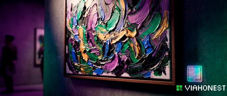
Texture can become a meaningful point of distinction in a crowded market. Original impasto paintings possess qualities that screens and prints cannot fully reproduce. Their surfaces respond to changing light, reveal evidence of the artist's hand, and provide the singular presence collectors seek in an original artwork.
Upload a selection of your strongest textured studies to ViaHonest and organize them as a coherent series. Use each description to explain the directional system, color logic, and material decisions behind the piece. Invite feedback, refine the series, and make the best originals available to buyers who value authentic process and distinctive technique.
Conclusion
Van Gogh's power does not come from thick paint alone. It comes from the integration of structure, directional energy, chromatic clarity, dark outlining, and controlled relief. Every stroke has a physical character and a compositional purpose.
To master the Van Gogh brush stroke technique, think in vectors rather than isolated marks. Let contours organize the image, place clean colors side by side, and use impasto selectively to establish hierarchy. Translate the same logic into Spaces through depth maps, directional masks, relief, and responsive lighting.
Most importantly, transform these post impressionism techniques through your own subjects and decisions. A historical method becomes commercially and artistically relevant when it supports a recognizable contemporary voice. Present that voice on ViaHonest, build a portfolio around your strongest expressive work, and give collectors the opportunity to discover the physical originality behind every surface.