Capturing Fleeting Light: Monet’s Color Harmonies and Grounding Secrets
Claude Monet did not simply paint landscapes. He painted the unstable relationship between color, air, water, and time. A cathedral changed as the sun moved. Snow reflected violet, rose, and blue. A river became a field of broken color in which the sky and its reflection seemed to exchange places. This sensitivity to changing conditions is at the heart of the Monet painting technique and remains relevant to plein air painters, landscape artists, and digital environment concept artists today.
To understand how to paint like Monet, it is not enough to imitate loose brushwork or choose bright pigments. The real lesson lies in organizing color before detail. Monet built relationships between warm and cool notes, light and shadow, opaque and transparent passages. He treated every hue as part of an atmospheric system. A blue was never merely blue. Its effect depended on the orange beside it, the warm ground beneath it, and the surrounding light.
Monet worked primarily in oil, not acrylic, so references to a pink acrylic ground should be understood as a modern adaptation rather than a historical claim about his materials. Contemporary artists can use acrylic ground because it dries quickly and creates an efficient surface for oil or acrylic painting. This updated process preserves the optical logic associated with Impressionism while adapting it to modern studio and plein air conditions.
The purpose of this guide is not to produce a literal Monet copy. It is to reveal a practical system for capturing light in painting. By combining a warm colored ground, chromatic shadows, dry-brush technique, deliberate palette preparation, and rapid outdoor observation, artists can create landscapes that feel luminous rather than merely bright.
The Physics of Impressionist Luminosity
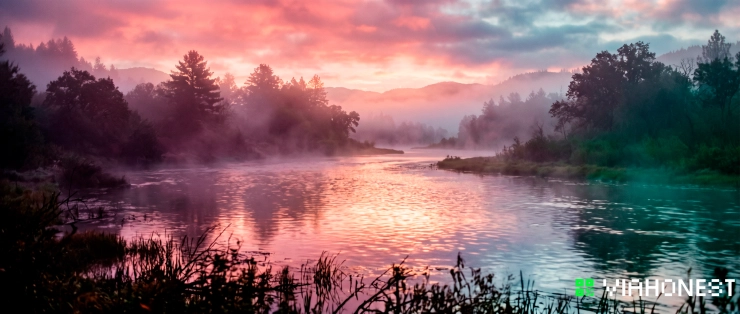
Luminosity in painting is not created by adding white to every illuminated area. Too much white can make a landscape chalky, cold, and visually flat. Light appears convincing when the surrounding colors establish a structure that allows selected passages to glow.
Impressionist painters relied on optical contrast. Warm hues become more radiant near cool hues. Muted passages make saturated accents appear stronger. Broken marks of different colors can merge at viewing distance, producing a vibration that premixed neutral paint cannot always achieve.
This is the foundation of optical harmony. The painter does not copy each local color separately. Instead, the entire canvas is organized around the dominant light condition. A winter morning may favor pearl gray, pale violet, muted blue, and reflected pink. A sunset may require orange, rose, lavender, and green-gray. Every mixture belongs to the same weather, hour, and atmosphere.
Monet's serial paintings demonstrate this principle clearly. When he returned to the same subject under different conditions, the physical object remained relatively stable, but the impressionist color palette changed. The subject was not only the haystack, cathedral, bridge, or water lily pond. The true subject was light acting upon form.
The Colored Ground Advantage
A white canvas offers maximum brightness, but it can also create a harsh beginning. Every first mark looks isolated, and uncovered gaps may feel unfinished. A colored ground immediately unifies the surface and gives the painting an atmospheric base.
For winter scenes, misty mornings, and evening landscapes, a pink acrylic ground can create the impression of internal warmth. When small areas of the ground remain visible between cooler strokes, they resemble reflected light passing through the painted surface. Pale blue snow appears more luminous against a restrained rose undertone. Gray clouds gain warmth without requiring obvious orange highlights. Cool greens become richer because they interact with a complementary foundation.
The ground should usually remain muted. A mixture of titanium white, a small amount of quinacridone rose or alizarin crimson hue, and a touch of warm yellow can produce a soft salmon or dusty pink. For a more neutral evening surface, add a trace of ultramarine blue. Apply the mixture thinly so the texture of the canvas remains active. A perfectly smooth, opaque layer can remove the visual energy that makes later dry-brush passages effective.
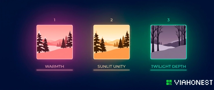
Warm ochre, peach, pale terracotta, and violet-gray are also useful choices. Select the ground according to the intended light. A warm pink can support snow and cold skies. Ochre can unify sunlit fields and autumn foliage. A muted violet can create depth in overcast or twilight scenes.
Underpainting techniques work best when the ground participates in the final image. Do not feel obligated to cover every part of it. Let narrow fragments remain between brushstrokes, especially in foliage, reflected water, cloud edges, and textured snow. These fragments connect distant areas of the canvas and establish optical harmony.
For digital environment concept artists, the same idea can be applied as a base color layer beneath the painting. Rather than beginning on pure white or neutral gray, choose a low-saturation atmospheric hue. Allow it to influence the edges and gaps between forms. This creates cohesion before rendering begins.
Elimination of Black: Chromatic Shadow Formulations
One of the most effective ways to create atmospheric color is to replace automatic black mixtures with chromatic shadows. Black is not forbidden, and historical painters used dark pigments in different ways, but relying on tube black for every shadow can reduce color variation and make outdoor scenes feel disconnected from natural light.
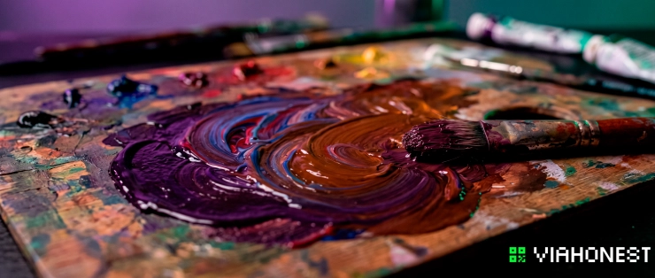
A flexible dark can be mixed from alizarin crimson, ultramarine blue, and yellow lake or a transparent warm yellow. Ultramarine and alizarin create a deep violet. Introducing a small amount of yellow neutralizes that violet and moves it toward a rich, near-black brown. The proportions can be adjusted according to the environment.
For a cool shadow, allow ultramarine to dominate. For a warm shadow beneath foliage or architecture, increase the crimson and yellow. For a neutral dark, balance all three while preserving transparency. This mixture remains responsive because it contains several color directions instead of a single dead endpoint.
Chromatic shadows are especially important when capturing light in painting. A shadow is not simply a darker version of the object's local color. It contains reflected light from the sky, ground, nearby buildings, vegetation, and water. Snow shadows may lean blue-violet because they receive cool skylight. Tree shadows across warm soil may contain cool blue mixed with reflected red and ochre. Evening shadows can appear surprisingly warm when the sky itself is violet or blue-green.
Avoid adding white too early to dark mixtures. White increases opacity and can weaken depth. Establish the deepest transparent notes first, then introduce lighter shadow planes where reflected light becomes visible. This creates a natural transition from depth to atmosphere.
Digital painters can use the same principle by avoiding a single black multiply layer over the entire image. Build shadows with hue shifts that respond to the color of the sky and surrounding surfaces. Even a dark foreground should contain subtle temperature changes.
The Monet Studio & Field Workflow
The Monet painting technique is often described as spontaneous, but spontaneity does not mean disorder. Rapid painting becomes more effective when composition, value, and palette decisions are made with discipline. The goal is to preserve immediacy while reducing hesitation.
A modern workflow can be divided into three phases: composition testing, dry-brush tonal placement, and palette pre-mixing. Each phase solves a different problem before detailed painting begins.
Phase 1: Rapid Charcoal Composition Testing
Begin with small charcoal studies rather than a detailed drawing on the final canvas. These tests should focus on the placement of major masses: sky, land, water, architecture, trees, and dominant shadow shapes. Ignore windows, leaves, branches, and surface decoration.
A strong landscape remains readable when reduced to three or four value families. Identify the lightest mass, the darkest anchor, and the middle-value bridge connecting them. If the composition fails at this stage, additional detail will not rescue it.
Test several crops quickly. Lower the horizon to emphasize the sky. Raise it to focus on reflections or fields. Shift a tree or building away from the center. Look for an arrangement that directs attention toward the primary light effect.
Transfer only the essential structure to the colored ground. Use charcoal lightly or draw with a thin paint mixture. Excessive linework can trap the painter into filling enclosed shapes instead of observing atmosphere. The drawing should function as scaffolding, not as an illustration waiting to be colored.
Monet's landscapes often feel natural because their compositions avoid rigid symmetry while maintaining balance. A dark vertical may be answered by a distant group of smaller forms. A horizontal shoreline may be interrupted by reflected marks. The eye moves through intervals rather than following a mechanical pattern.
Phase 2: Dry-Brush Scrubbing for Tonal Layout
Once the composition is established, use a dry-brush technique to place the main tonal masses. Load a firm bristle brush with a small amount of paint, then remove excess paint before dragging or scrubbing it across the textured ground. The brush should deposit broken particles of color rather than a thick, continuous layer.
This method allows the warm ground to remain visible. It also prevents the first stage from becoming too polished. Sky, distant land, and shadow masses can be suggested with thin, textured veils while preserving room for later corrections.
Keep the initial mixtures restrained. A muted violet-gray may establish distant trees. A cool blue can indicate snow shadow or water. A warm gray may define cloud structure. At this stage, accuracy of value is more important than maximum saturation.
Work broadly and avoid outlining objects. Instead of drawing every tree, establish the collective mass of the tree line. Instead of tracing each cloud, place the larger movement of light and shadow. The atmosphere should connect forms before detail separates them.
Dry-brush scrubbing is also useful for soft transitions. A nearly empty brush can pull one color across another without fully blending them. This creates broken edges that suggest mist, reflected light, foliage, and moving water. Save sharper edges for the focal area or for forms that interrupt the light decisively.
In a digital workflow, use textured brushes with pressure-sensitive opacity and allow the underlayer to show through. Resist airbrushing every transition. Controlled gaps and broken marks can reproduce the visual vibration of physical pigment on a textured surface.
Phase 3: Palette Pre-Mixing Discipline
A changing landscape does not wait for the painter to solve every mixture from the beginning. During plein air painting, the light may shift within minutes. Palette pre-mixing allows the artist to observe and respond without repeatedly interrupting the process.
Before painting the final passages, prepare several organized color families. Mix a sequence for the sky, another for the ground or water, and a third for major shadows. Within each family, create warm, cool, light, middle, and dark variations.
For a winter impressionist color palette, the sky family might include pale blue-gray, warm pearl, muted lavender, and soft peach. The shadow family might include ultramarine violet, neutralized crimson, and deep blue-green. Snow lights could range from warm cream to cool white, depending on their relationship to the sun.
Pre-mixing does not mean blending every color into a uniform gradient. Its purpose is to establish harmony and provide clean options. Keep mixtures physically separated so they remain distinct. Use a palette knife to create enough paint for repeated marks, especially in large sky or water passages.
Compare colors relationally. Ask whether a mixture is warmer, cooler, lighter, darker, more saturated, or more neutral than the color beside it. This is more reliable than trying to name the exact hue. Atmospheric painting depends on relationships, not isolated formulas.
Once the palette is prepared, apply marks with greater confidence. Place adjacent colors and allow the viewer's eye to combine them at a distance. Avoid excessive brushing after each stroke. Overworking can destroy the freshness that gives Impressionist painting its sense of passing time.
The final highlights should be selective. A few high-value, warm or cool notes can activate the whole scene if the surrounding values are properly controlled. Light becomes powerful through contrast and placement, not through quantity.
Plein Air Challenges in the Modern Era
Plein air painting offers direct access to natural color, but it also introduces practical limitations. Wind moves the easel, sunlight changes the appearance of the palette, and acrylic paint can dry before a mixture reaches the canvas. A successful field setup should reduce friction and protect the artist's attention.
For acrylic painters, rapid drying is the most immediate challenge. Use a stay-wet palette, keep mixtures out of direct sun, and carry a fine mist sprayer. A compatible acrylic retarder can extend working time, but it should be used according to the manufacturer's instructions. Too much retarder may weaken the paint film or leave the surface tacky.
Prepare the pink acrylic ground in the studio and allow it to dry completely before traveling. This saves time and provides a stable surface. If conditions are hot or windy, work with smaller paint quantities and remix as needed. Larger brushes also encourage decisive placement before the paint begins to set.
A portable pochade box should hold only essential colors, a few reliable brushes, a palette knife, water or appropriate painting medium, clips, paper towels, and a waste container. A limited palette is often more useful than a large assortment of pigments because it simplifies decisions and supports unity.
Position the palette and canvas under similar light. If the palette is in shade while the canvas is in direct sun, value judgments become unreliable. A neutral umbrella can help, provided it is firmly secured and does not cast a strongly colored light.
Plan around a specific observation window. Rather than trying to paint the entire day, choose one light condition and commit to it. Make a note of the starting time, dominant temperature, shadow direction, and lightest accent. When conditions change, use these observations to preserve the original effect instead of chasing every new variation.
Photographs can support memory, but they should not replace direct observation. Cameras often compress values, distort color temperature, and freeze movement. A small color note made on location may contain more useful atmospheric information than a highly detailed photograph.
The most productive plein air sessions do not always produce finished paintings. Field studies can become visual research for larger studio works. Their value lies in recording relationships that are difficult to invent later: the violet beneath a cloud, the warm reflection inside a cool shadow, or the precise moment when distant trees merge with evening haze.
Showcase Your Landscape Art to Global Collectors
A landscape painting records more than a location. It preserves an encounter with a specific hour, season, and quality of light. When that work is presented online, collectors need context that helps them understand both its visual atmosphere and its artistic process.
ViaHonest gives independent artists a dedicated marketplace environment in which to present original art to an international audience. For plein air painters and landscape artists, this creates an opportunity to show finished works alongside the ideas that shaped them, from underpainting techniques and palette decisions to the weather and location that inspired the composition.
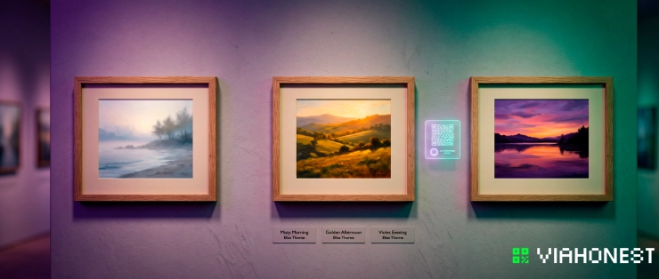
A coherent presentation can make a landscape series more compelling. Photograph each artwork in balanced light, provide accurate dimensions and materials, and write a concise description of the scene and process. If a pink acrylic ground influenced the final harmony, explain how it remains visible through the cooler layers. If the painting began outdoors and was completed in the studio, describe that development honestly.
Artists can also organize related pieces as a focused body of work. Winter light studies, coastal atmospheres, evening rivers, urban reflections, or seasonal plein air paintings can communicate a recognizable artistic direction. This helps collectors and art professionals understand the continuity behind individual works.
Register on ViaHonest to present your landscape art, develop a professional presence, and connect your practice with collectors and international art dealers exploring original work online. Artists can also follow opportunities for relevant themed online exhibitions and use atmospheric landscape series to demonstrate a distinct command of color, light, and place.
The strongest invitation to a collector is not imitation of Monet's surface style. It is evidence that you have learned to observe with similar intensity. Use warm grounds to activate cool passages, construct chromatic shadows instead of defaulting to black, pre-mix a disciplined palette, and let individual marks preserve the energy of the moment.
Monet's lasting lesson is that light cannot be captured as a fixed object. It must be reconstructed through color relationships. When every area of a painting belongs to the same atmosphere, the canvas begins to glow as a complete system. That optical harmony can transform a simple landscape into a record of fleeting perception.
Apply these methods in the field, refine them in the studio, and present the resulting work on ViaHonest. The landscape may change from minute to minute, but a thoughtfully created and professionally showcased painting can carry that moment far beyond the place where it began.